Rebranding is a rare opportunity for us to address where we are as a company and where we are going. For us here at Heritage, it’s been long overdue.
Our process was led internally by Creative Manager Billie McKenzie and key members of the executive committee. The goal was to envision the future of Heritage Cannabis, who we are and what we have to say, so that we could form a better connection with our investors and customers in the medicinal and recreational cannabis markets – yep, that’s a mouthful! In truth, we needed our branding to match our optimism, beliefs, and devotion to leading the cannabis industry globally.
The creative team sat down individually with several of the longtime leaders behind Heritage to capture what Heritage meant to them and what they wanted to show the world. These discussions were deep, and ran over the course of several weeks. As we digested that information, we found a common thread weaving together the history of Heritage: an instinctual drive to innovate and continually redefine the recreational industry, with a belief in helping others through medical cannabis.
Through their stories, we gained a deeper understanding of what Heritage actually is; rather than trying to recreate Heritage’s identity, we were able to pull out what was always there, waiting to be discovered.
It is just mind-boggling the chain of events, the beautiful story, that brought us all together… it was all for a reason: we’re here to change the world.
— PJ, VP of Innovation & Product Design
Lives have been changed through cannabis, and we strive to move that mission forward by challenging misconceptions of the cannabis industry to bring our product to new markets. Our brand is meant to impart that positivity and curiosity that we hold for the future of cannabis.
The logo
How was the logo designed, what were the considerations, were there any challenges in designing the logo?
As we settled into our design work, we needed to set some boundaries to help guide our decision making. At this point, we started to look at other major brands both inside and outside of the cannabis industry. We needed a frame of reference to ensure that Heritage would stand out, not blend in with the crowd.
First things first, we needed to know our clientele! This is particularly challenging for us as a holding company, given that we reach customers in all demographics. Investors, consumers, other businesses – they are all within our scope of operations and part of our business.
From recreational to medical, flower to extracts, technology to production, and everything in-between—Heritage is involved. There’s no intermediaries here. That gives us a lot to work with, but also presents us with a unique challenge: to compile everything we do into one brand that houses it all!
Our logo is a versatile emblem that looks at home whether it’s on a product label or a business proposal. It’s modern, recognizable, and yet simple enough to be used in conjunction with any of our sub-brands.
I like that it is so versatile. It represents our heritage. The people behind the brands of Heritage have a long history and rich stories with cannabis.
We wanted to represent our heritage and experience – but with a modern and innovative look. Heritage is driven by innovation and this needed to be clearly reflected in our new branding.
— Billie McKenzie, Creative Manager
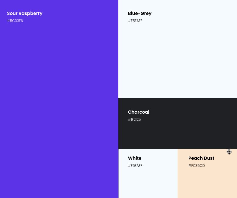
The colour
Deciding on our primary colour was a lot of fun for us. We experimented with a variety of colours through the design mock-ups and layouts we had already established, testing and mixing palettes to find something that felt right.
At one point, we were fairly sure that we would go forward with an electric blue colour. We thought it was a good fit since it made us look more like a technology company. In the end, the blue fell out of favour as we felt it was being used by too many technology companies already – we needed to stand out, not blend in, right? And so that is what brought us to purple!
There are a lot of meanings embedded in a colour. The ideas associated with each are tied to their cultural usage and shared history. Red is the colour of love, green is the colour of nature, and so on. But it goes a bit deeper than that too…
Purple, for instance, is often associated with royalty because of its rarity in antiquity. The dyes used to create purple cloth and furnishings were prohibitively expensive, and that sense of rarity and royalty lives on in how the colour is often interpreted today. Magic, or the supernatural, is another attribute closely associated with purple, likely due to its popularity among witches and wizards in folk art throughout the 19th and 20th centuries. To us, the colour purple expresses our innovative and experimental approach with the status that comes along with it.
One quote I really liked when I was looking at the meanings of the colour purple was this: ‘Since violet is the last visible colour of the spectrum before ultraviolet – it is on the borderline between visible and invisible.’
It reminded me of how this rebranding has been our opportunity for us to really come out of hiding and stand up on the world stage as a top player in our industry.
— Billie McKenzie, Creative Manager
Purple was a natural fit for us. It evolved out of the blue we had been working with, bringing out a sense of originality and royalty that the blue lacked. We loved that the purple could seamlessly fit in with the recreational market as well. It’s a bold shade that really leaps off the page, demanding attention. We are also excited to see it in use on our apparel!
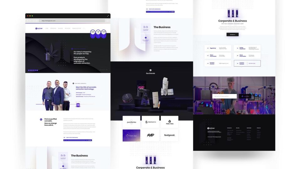
The website
The redesign of our website was meant to be the culmination of our branding work. It was an opportunity to tie up all of the work we had done into a complete package. Most importantly, though, our website needed to be useful for both our investors and our retail customers. It needed to evoke the Heritage story without losing the importance of our business and growth.
Early on, we were quite sure that we wanted our team member’s stories to be prominently featured on the website. They cover the moments that have been truly defining of our brand as Heritage Cannabis has grown alongside the cannabis industry – how could we leave out that gold mine of content? Naturally, this was one section that we needed to have prominently featured. So, we decided to include a “Featured Brands” section on the homepage where we could share a new story from one of our sub-brands each month. That is our Heritage.
We also needed the website to be useful for our investors. Right at the top of the page, and following the user everywhere they go, there’s a stock ticker showing the current share price and percentage change for the day. We’ve also have our press releases integrated on the “News” page to keep our fans up to date on what’s happening internally.
Heritage Cannabis is the root that ties together medicinal and recreational cannabis brands. Right there, smack dab in the middle of our homepage, we are showing off our sub-brands and their products. These are the companies that are being launched by integrating our streamlined processes and technologies. Together, we can do so much more!
Our hope is that these brand pages will grow to show all the latest cannabis and extraction tech that is currently under development in-house. For instance, Pura Vida created the best full-spectrum extract in the first all-glass dispenser (the only other dispenser on the market has been a distillate that uses plastic which can melt when used with dab rig); RAD “RADSICLES” are the first THC freezies created.
As a vertically-integrated cannabis company, Heritage Cannabis is supporting the best research available in the cannabis industry to create better products for the recreational market.
Check back to see our latest stories and creations next month!
Conclusion
Our redesign came together as a result of the stories from our past. The culmination of brilliant minds from inside and outside the cannabis industry, Heritage Cannabis is paving the way forward to new markets and a thriving recreational industry. Our branding will bridge the gap between our medicinal and recreational business, helping us to realize the possibilities that come along with vertical-integration in the market and supply chain.
Now, we have the visuals to match our vision for the future of cannabis. We will be more engaged in our marketing efforts moving forward, ensuring that our message is reaching the people who matter most to our success. First we purified cannabis, now we change lives through it; and together, we can change more lives than ever before.
